Magnolia

Bridging the gap between you and your library

The Basics

Team

Infamous Interators

Timeline

6 Weeks

Role

UX + UI

Magnolia is a clean and friendly mobile app that connects users to their librarians and library resources to help users advance and learn new skills fit for a changing job market. With Magnolia, users can take classes, access career counselors and utilize librarians for research. The library is no longer meeting the growing needs of technology, resulting unused resources. 

[

Goal: Design a product that will strengthen the library’s relationship with the community it serves by placing an emphasis on:

  • Career development
  • Skill-building
  • Career counseling
  • Networking

]

My Design Process

1. Empathize

Research

We began with exploratory research to gain a better understanding of what exists in the market by for library-based apps. We did this by creating a Competitive Analysis, sending out a Survey and reaching out to librarians and users for Interviews. Some things we came to understand were:

  • People perceive the library differently, associating it with books and story time. They do not associate it with career services and professional development.
  • There are many online learning platforms, but none fall in line with the public library 
  • People prefer learning online

Who are the competitors?

When looking at the library system, we needed to understand what others were doing. Because the primary focus was vocational advancement, we researched systems that showcase career growth and skill building and created a Competitive Analysis. 

Click to View Full Competitive Analysis

What do users think?

Using Google Forms sent out a survey to as many people as we could. If we were going to understand how the library was viewed and utilized, we needed to hear from a wide variety of people in a wide variety of places. One of the questions asked was “Describe your local library in 3 words”. This word cloud shows their responses with the larger words being used with more frequency. 

Screen Shot 2020-08-17 at 8.30.36 PM

What we learned

Negative Perception of Library

Unaware of what the library offers

Prefer online learning

Lacking guidance and support

Asking the Experts

We interviewed a number of librarians, asking about their experience with the changing landscape of the library system and the way in which the library is being both utilized and underutilized

“The importance of a physical location that is able to meet changing community needs, is it can’t be understated.  Whether it’s providing meeting rooms for people who are launching small businesses, or for tutoring, or community organization.”

-SME 2

Life has gone digital and a lot of people are left behind. And libraries are a necessary bridge to keep people functioning in society.”

-SME 1 

“We  don’t really have a handle on what is actually being utilized. People have a difficult time using our resources. We have pamphlets that are there to help and the resources themselves have tutorials, but if they’re being used is unknown.”

-SME 3

Interviews

We interviewed a total of 12 users to find another perspective on the library. From which we gathered more findings:

  • Mentorship is valued.
  • More guidance on career websites.
  • Would change careers, but no clue how.
  • Sees no value in physically going to the library.
  • Library is for books only.
  • Library is antiquated.

“If there was an easy way to filter through information to pull out all of those really important helpful things you can find on the internet and combine that into online courses, I would love it.”

-User 1

“Podcasts are starting to take over books. I can’t read a book while I’m driving, I put on an audio book. But maybe the library can offer something like that.

-User 2

“In larger cities where younger generations are involved with the library, promoting different offerings might get people more interested and utilizing their services.”

-User 3

2. Define

Synthesizing Our Data

One of the challenges working on a product like this is just how many angles there are to explore. Synthesizing the data into chewable bits required some organization and data filing. We put together a chart and two affinity diagrams that allowed us to put everything in one place as well as amalgamate those the common behaviors into one or two personas. 

Our Users

Meet Lance and Sam, our User Personas. Both came out of our research and really allowed us to identify with the product we were designing. Lance, our primary persona, and Sam, our secondary persona, both struggle with starting a business and are in need of guidance. Read about their journeys. 

Click to View
Click to View

Problem Statement

The online learner needs to efficiently access their library’s resources in order to professionally grow and improve their sense of fulfillment while having a balanced lifestyle.

Design Principles

Supportive

Trying to grow and improve oneself can be tough to navigate alone. We enable support and connection between the library and its members to empower each other.

Harmonious

A library is a place of community and history; technology is forward moving and innovative. We facilitate bridging these two concepts in balanced harmony.

Approachable

Taking on a new skill or career can be intimidating. We promote inclusivity and joy in learning to make it delightful and engaging.

Supportive

Sharing ideas and victories make a journey that much more impactful.

Supportive

The ability to create context and understanding from learning is key to truly flourishing as a person.

3. Ideate

6-8-5 Sketches

Information Architecture

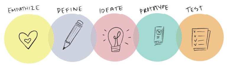
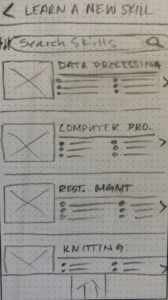
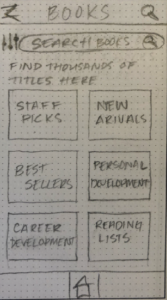
With so many ideas bouncing around, we needed to find a ways to narrow everything down. We used card sorting and Money Mapping to parse out some of our tasks.

With five new-to-UX team members, our excitement and passion was abundant.

With money mapping, each team member had $100 to allocate to any feature. The features with the most money remained. 

Card Sorting

Money Map

Click to View

AHA! Moment

What are we doing here?! 

The complexity and ambiguity of this product was a challenge. We had to really roll with the punches as our research took us on a wild ride. We had so many tasks and features that ended up taking the back-burner. And then, AHA! we realized that we needed to leverage the librarian and job skills aspect. Reading and research apps already exist (Libby, Overdrive). It was time to reframe our thinking. 

App Map

After mapping out tasks, we were able to create a site map that gave us the structure we needed to continue.

Task Flow Diagram

To begin developing the information architecture of our platform, we did a brainwriting exercises to map out user tasks. Here our user is searching, comparing prices and completing point-of-sale.

Click to View
Click to View

4. Wireframe & Prototype

Mid Fidelity Wireframes

Getting closer to a finished product and with incredible amounts of pressure to finish up in time for our deadline, we began developing our product in mid fidelity on Figma. 

Log in/Sign up

New users can sign up for an account using email, google, facebook or simply proceed as a guest. They are also encouraged to enter their library card number to ensure the most beneficial experience. If they do don’t have a library card, they are sent to their local library website to sign up for one and sent back to the app. 

Tutorial

The user is then given a quick tutorial so they are better oriented to the app, but are given an opportunity to skip it. 

Home Screen

The home screen gives users local recommendations such as events and courses in their area of interest and location. It also offers suggestions based on the users history with three primary areas:

  • Skill building
  • Job services
  • Business services

Chat with the Librarian

Users are given the same tools they would have while at the library. At any moment, they can chat with a librarian to get any quick answers they may need regarding their research. 

Schedule a meeting

Librarians hold a wealth of information. A user can find a librarian specializing in the area in which they are researching schedule a meeting with them via video call, telephone or in person.  

Sign up for a class

Local libraries an abundance of classes and workshops that cardholders have access to. Finding them is the challenge. With Magnolia, they can search, save and sign up for them with ease. 

5. Test

Usability Testing

We gathered quantitative data about the effectiveness of the six main task flows of the Magnolia app. We looked at how the user navigated the app to accomplish the goal and see if it matched the way the flow was designed. We noted anywhere the user got caught up or chose a different action than intended to complete the task. We collected qualitative data along with testing the apps ability to be aesthetically pleasing and appealing to the target demographic.

A deep dive into the specifics of these usability tests can be found in the Usability test report. 

Findings and Recommendations

  • Reconsider app vs. Mobile-first website
  • Reconsider term “librarian” to something more specific, e.g. “career specialist”
  • Redesign 3rd party app integration to be more accessible to Magnolia users
  • Reconsider the Homepage information architecture
  • Reconsider what the main features are:
    • Librarian
    • Calendar
    • Resources
  • Reconsider Visual Hierarchy
    • Top navigation bar’s visual weight is very high