House 2 Home

Convenient home renovation and repair in your pocket

The Basics

Team

CODA Design

Timeline

1 Month

Role

UX Designer

House 2 Home is a one-stop-shop virtual platform that takes the guesswork out of hiring home service professionals. Without leaving the app, users can do things like find inspiration, research city ordinances, compare prices, see certifications and licenses, message/video chat with professionals, schedule service, pay an invoice and manage their house projects. Skip the hassle and headache by doing everything in one place. 

The Challenge

Our team was asked to design a e-commerce marketplace that would connect millennial homeowners/renters and home service professionals to provide them with the value, simplicity, trust and transparency the need. Our mission was to develop the customer-facing side that would give them the tools they need to confidently hire home service professionals. 

The Goals

Design the consumer-facing side of the platform, assessing the full end-to-end customer journey of the home repairs process in order to build a home services marketplace that brings ease, transparency and control to users.

My Design Process

Untitled_Artwork 12

Research

Survey

Competitive Analysis

User Interviews

Affinity diagram

User persona

User stories

User journey

Problem Statement

Design Principles

6-8-5

Brainwriting

Sitemap

Low-fi Wireframe

Mid-Fi Wireframes

Mid-Fi Prototype

User Test


1. Empathize

Research

The digital gap between modern homeowners/renters and home service professionals needs to be bridged through a one-stop-shop app that addresses the needs of both the service professionals and users. 

  • Users are concerned about finding safe, reliable and trustworthy service professionals. 
  • Users do not trust service professionals based on online reviews alone.
  • Users aren’t able to compare prices without being added to various calling lists, having their leads sold to other service professionals. 
  • Users are inconvenienced by not having virtual pay options.
  • Scheduling over the phone is a pain point.

Survey

Our process began by creating a survey for our intended target audience – homeowners/renters identifying as “millennials”.

Interviews

We were very eager to understand what the primary needs of our users were and had a fairly open-ended interview agenda. We simply wanted a more qualitative understanding of how people find and hire home service professionals. Our team conducted a total of 16 interviews. All of which were homeowners within the ages of 20-40. There were a total of 15 questions regarding their behaviors and experiences with hiring home service professionals. 

“If someone I know and trust has a recommendation, I’d rather go with that than looking online, but if not, I’ll go online.”

-User 1

“If we can do it ourselves, we will, but it doesn’t make sense to pay money for supplies to try and DIY something, do it wrong, and have to hire someone anyhow. That’s a waste of time.”

-User 2

Findings

  • Many of the participants used virtual scheduling through an app.
  • Credit cards, Paypal, Apple Pay and Amazon pay were among popular methods of payment.
  • People would rather pay through an app if they feel it is safe and trustworthy.
  • Among the services listed, home repairs were used more than home improvement projects. 
  • Security and safety is an important factor for participants hiring home service professionals.
  • Most users emphasized the need for the ability to compare prices as well as reasonable pricing.

Competitive Analysis

We created a robust competitive analysis with the hopes of finding the gaps and areas of over saturation within the home service industry. Three things stood out during our interviews:

  • If and how service professionals were vetted and screened.
  • We’re virtual payments offered.
  • Was scheduling done over the phone or using an online system.

2. Define

After conducting research, our team was ready to take the information we received and start to amalgamate it and make more sense of it. 

Affinity Diagram

Our team gathered for an affinity diagramming session to synthesize the information we received in our interviews. There was a lot to discuss and shows how challenging it can be to organize data from qualitative studies and interviews. 


Screen Shot 2020-08-15 at 3.37.37 PM
Click to View

User Journey Map

Our next step in understanding and defining our user was to design a journey map. I created this one using Figma. Having taken the feedback and experiences told to me by our users during interviews, I was able to develop a journey that our user went through that led her to our platform.

Screen Shot 2020-08-15 at 3.42.37 PM
Click to View

Persona

Meet Sarah V., a 30 year old therapist who just moved to a new town in Texas. She is married with a young daughter. She is a tech savvy, review reading, price comparer. She is frustrated by poor quality work and misinformation and heavily motivated by safety and quality.


Screen Shot 2020-08-15 at 3.38.48 PM
Click to View

User Stories

After identifying who our user was, it was time to really empathize and understand her. In order to do that, I created a series of user stories based on different motivations and perspectives. This really helped us remain loyal to our user.

Problem Statement

Our team workshopped to create a problem statement that would address the problems, needs and end goals of our users. 

The tech savvy  homeowner wants an easy and reliable way to conveniently compare quality home service professionals tailored to their home needs in order to make the most informed choice to provide safety, security and the best bang for their buck.

Design Principles

Transparent –  Exercising openness and honesty to cultivate trust and certitude with our users and professionals. 

Effortless –  The approach of removing the friction that would turn customers away in order to earn customer loyalty 

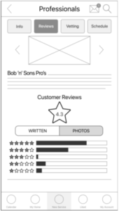
Reliable – Appropriately vetting all professionals and users to ensure professionalism and safety in all areas of our product. 

Sustainable –  Our product will be relevant to our users as well as uniquely tailored to our users.

Excellence – Our users and professionals will always receive the highest quality in both experience and final result.

3. Ideate

AHA! Moment

Before we could proceed at all, we needed to identify what device the platform would be on. Our research indicated that users often used laptops and desktops to research and find inspiration. 

We had intended on creating a digital platform that was built for a desktop, however, everything else such as scheduling, communicating and completing payments was preferred to be done on a mobile device. Because of this, we decided to create a mobile app to allow for the simplicity and continuity from beginning to end of the users process

6-8-5 Sketches

Low Fidelity Wireframes

Brainwriting

To begin developing the information architecture of our platform, we did a brainwriting exercises to map out user tasks. Here our user is searching, comparing prices and completing point-of-sale.

Click to View

Information Architecture

After mapping out tasks, we were able to create a site map that gave us the structure we needed to continue.

Click to View

4. Wireframe & Prototype

Mid Fidelity Wireframes

Getting closer to a finished product and with incredible amounts of pressure to finish up in time for our deadline, we began developing our product in mid fidelity on Figma. 

Splash Screen/sign up

slkjdf

Onboarding

oakjf

Home Screen

jb

Search/Compare prices

Users can make any changes to an existing menu or create a new one. 

Schedule

kjh

Chat/video chat professional

kjh

View Past, Current and Future projects/pros

kjh

Complete Point-of-sale

kjh

5. Test

Usability Testing

9 usability tests were conducted for the House 2 Home application prototype. Usability testing sessions were held remotely over Zoom where the user’s interactions with the product were recorded. The facilitators conducted the test providing a link to the House 2 Home Invision prototype and were asked to complete 9 different tasks aiming to solve the problem statement. The primary focus of the tests were to assess:

  •  Navigability

  • Organization

  • Appeal

  • Functionality

The test consisted of 8 participants ranging from the ages of 23 to 34. They were tested remotely via zoom by one moderator and asked to complete 9 tasks on an Invision prototype.

A deep dive into the specifics of these usability tests can be found in the Usability test report. 

Findings and Recommendations

  • User found it inconvenient navigating back to the profile page after going to messages from the company profile
  • User’s were confused about bottom navigation and recommended labeling each icon.
  • User also recommended changing the explore icon to a home icon for less confusion
  • User recommended adding a GPS feature to track the professional before they arrived to your house
  • User recommended to add the service hours in the invoice to better track the hours worked
  • User recommends to add Google Pay to the list of payment options
  • Users often take different paths to find things. Offering multiple alternatives to find what they are looking for will help.
  • User recommended a back button on invoice